Top 10 Website Trends for 2023
The internet is inherently ever-changing, and as we move into 2023, we can expect to see several new design trends that will reshape the way websites look and function. As experts in Calgary web design, identifying trends like these is an important way to ensure we can provide expertise that keeps your business relevant and contemporary.
These trends are being driven by the need to create more visually engaging and interactive websites that function on mobile and web for day-to-day use. This is the year of delivering a seamless user experience – with mobile-first design, digital artistry, and trendy visual cues taking over a playful yet earnest gen-x web scape.
When people visit a website, it only takes them 0.05 seconds to make a first impression based on visual appeal alone – make sure yours makes a good one.
MINIMALISTIC DESIGN
Simple, clean and uncluttered designs will continue to be popular. Simplicity seems to dictate modern and luxury design as it highlights quality over quantity. This means creating subtle, advanced enhancements like non-traditional scroll effects or engaging carousels for content that utilizes minimalism's purposefulness.
DARK MODE
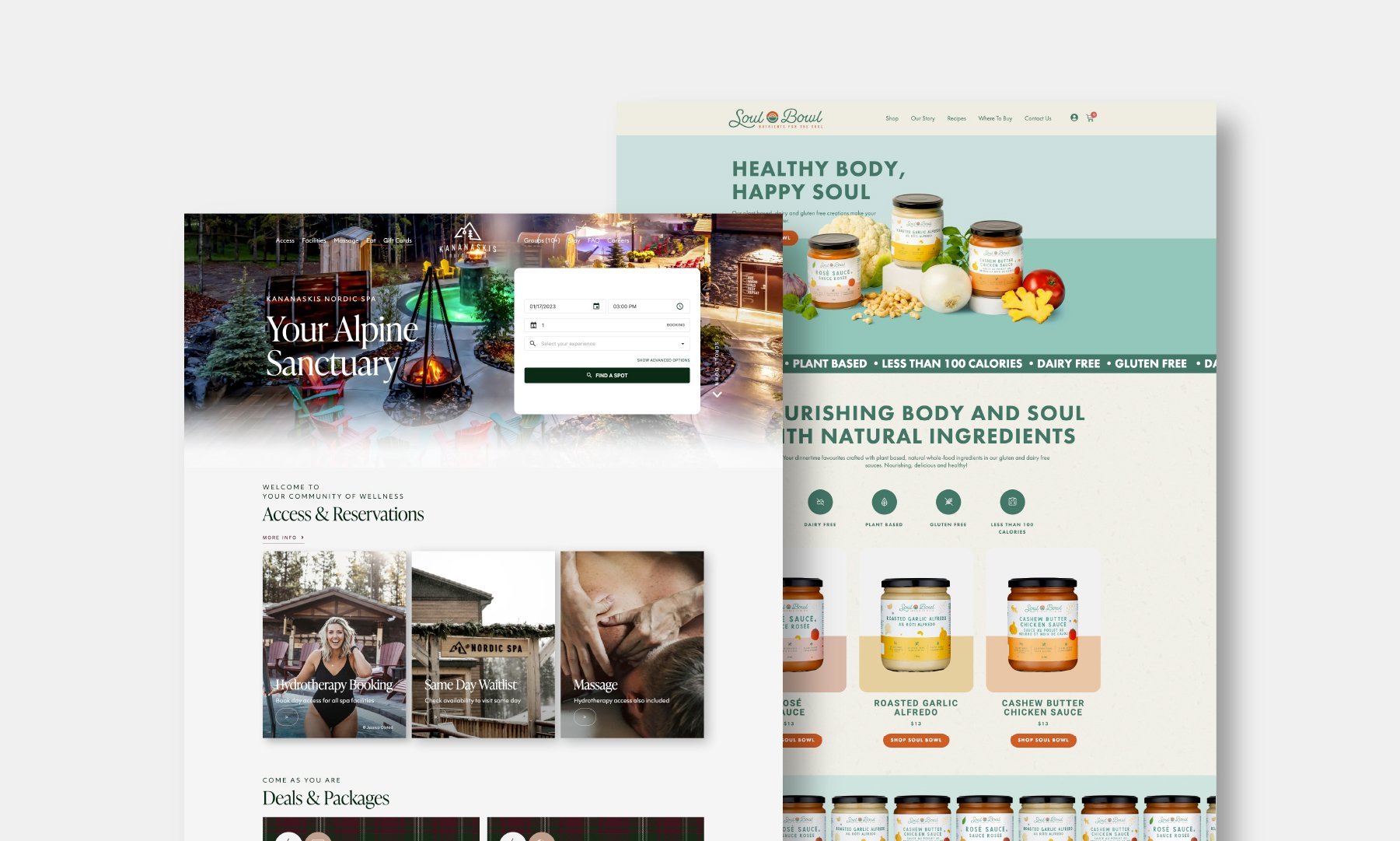
Dark mode is becoming increasingly popular, as it’s easier on the eyes and can help save battery power on mobile devices. Colour choices with dark mode are important as it’s less versatile than white – but this also means that effective design choices will pop. Correct choices can evoke an association with a certain experience – like the elegant ambience of a dimmed cocktail lounge.
ASYMMETRICAL LAYOUTS
Asymmetrical layouts create a more dynamic and interesting visual experience as they embrace artistry and challenge the design status quo. Gone are the days of perfect alignment. Layouts such as offset masonry grids are chosen instead for visual interest. Asymmetrical layouts continue to gain popularity in relation to other internet-borne visual trends.
3D AND ANIMATION
As per Research Gate, 94% of first impressions when visiting a website are related to design. 3D and animated elements enhance your design, making your website more intuitive and responsive. Programs like Blender have simplified the generation of high-quality renders, which has also increased the accessibility of resources available to designers.
BOLD TYPOGRAPHY
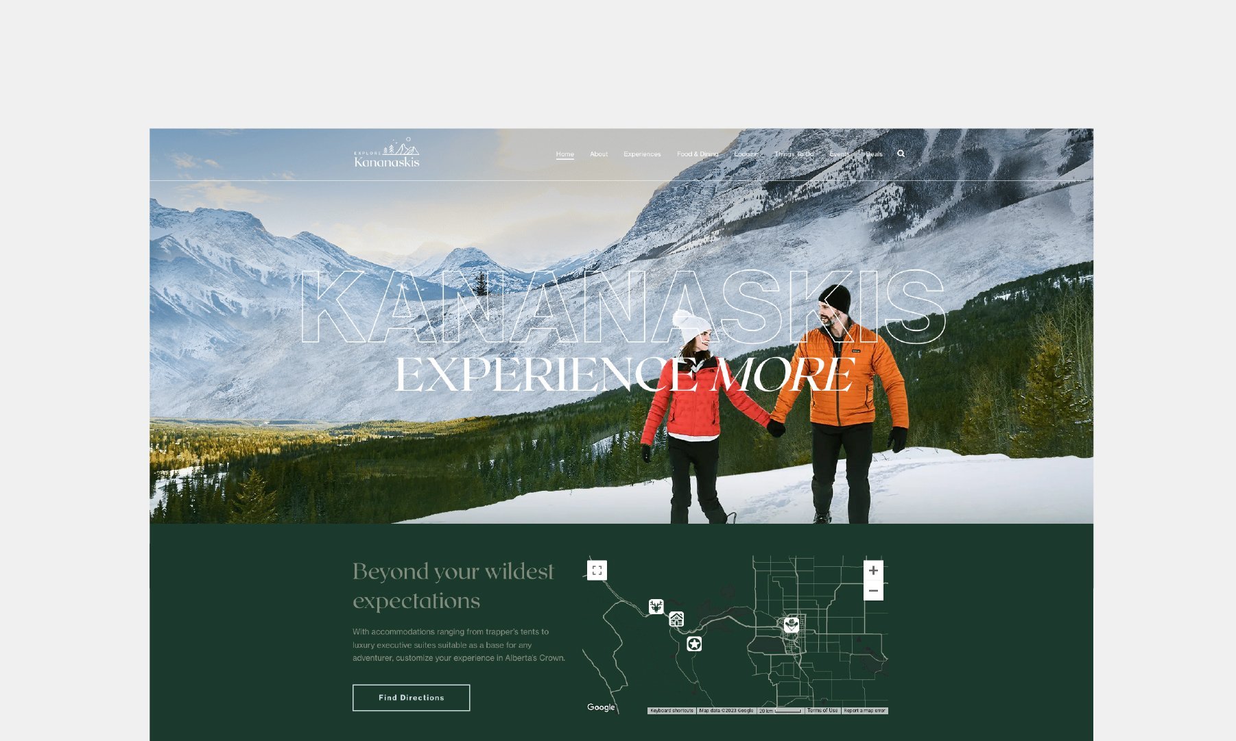
Similar to minimalist design choices, utilizing bold typography makes headlines and other important text stand out. As previously mentioned, it only takes users 0.05 seconds to make an impression about a website – increasing the importance of quick, easily readable typography that immediately communicates what you need visitors to see. A common use of this is in moving marquee banners, which bring a nostalgic feel to digital platforms.
MICRO-INTERACTIONS
Small interactive elements make websites more engaging by providing feedback on users' actions that entices them to keep scrolling. These types of design aspects will not be found on templates, and instead are utilized by skilled web designers who have learned how to bring websites to life.
VECTOR GRAPHICS OVER PHOTOS
Vector graphics and illustrations will be used more often in place of photographs. Concerning website speed, SVGs are required to not drain load speed or impact resolution when resized. With oversaturation and repetitiveness of stock photos, users know how to spot visuals that are chosen without much function. Custom-branded graphics and illustrations communicate high-quality branding.
FOCUS ON MOBILE OPTIMIZATION
Many of JYZ Design’s websites are constructed mobile first as more people utilize their mobile devices for day-to-day purposes. Designing mobile first lets us bring the app experience to the web, ensuring website visitors enjoy a seamless, purposeful design experience rather than one designed as an afterthought.
BOLD COLOURS AND GRADIENTS
The internet is at the core of trendsetting. Digital trends like Y2K that include fun, playful aspects have gained significant traction by playing on communal nostalgia and cravings for bold media that goes against the grain. Brands with an affinity towards nostalgia, spirituality or just general boldness have adopted bright colours and gradients last year and into this year on their websites. Especially popular in direct-to-consumer product brands, we see bright colours, gradients, and notes of texture reigning supreme this year.
VIDEO BACKGROUNDS
Video killed the radio star for a reason. Although video can be draining on speed, its dominance on social media platforms in short form has undoubtedly flowed into website design. There is no better way to portray an experience through visual storytelling, and video can allow you to portray stunning, engaging visuals as soon as they open the page.
Written by Julia Doten, Copywriter and Content Creator for JYZ Design. Julia is a copywriter, content creator, and literary enthusiast based out of Calgary, Alberta. A journalism graduate with experience in the non-profit sector, she uses her storytelling skills to write about topics ranging from tech to travel.


