A Canadian Take on Pinterest’s 2026 Colour Palette and What It Means for Brands
Pinterest’s newly released 2026 Colour Palette offers more than visual inspiration. Built from billions of searches and saves, it reflects how consumers want to feel in the year ahead. For Canadian brands, these colour signals land differently, shaped by our climate, cultural preferences, and buying behaviours.
The five colours defining 2026 are Cool Blue, Jade, Plum Noir, Wasabi, and Persimmon. Together, they point to a consumer mindset balancing calm and confidence, restraint and expression, comfort and creativity. This balance feels especially relevant in Canada.
Colour as Emotional Strategy, Not Decoration
Colour trends are no longer just design choices. They are emotional cues. Pinterest’s 2026 palette reflects consumers navigating uncertainty while seeking joy, clarity, and moments of escape.
For Canadian marketers, this means colour decisions increasingly signal empathy. Brands are expected to understand how their audience feels throughout the year, not just what looks good on a grid.
Cool Blue: Trust, Calm, and Winter Comfort
Cool Blue anchors the palette with icy, serene tones tied to clarity and wellness. In Canada, where winter dominates nearly half the year, this colour aligns naturally with how people live and shop.
This shade works especially well for trust-driven categories like financial services, healthcare, telecom, and technology. Brands such as RBC, TELUS, and Shopify already rely on cool tones to convey reliability and clarity. Expect to see more brands doubling down on blue-led palettes in digital design, UX, and brand refreshes.
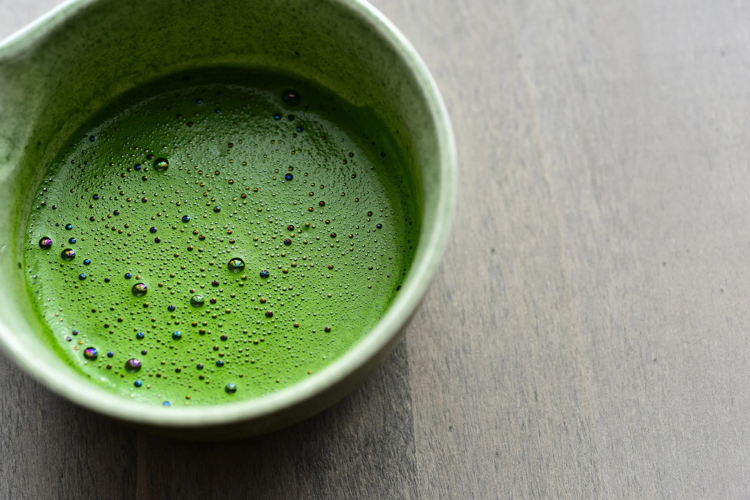
Jade: A More Sophisticated Take on Sustainability
Green is familiar, but Jade represents its evolution. Sitting between mint and moss, it feels earthy without being rustic and modern without being cold. This tone reflects a more mature sustainability narrative.
Canadian brands like Lululemon, Rocky Mountain Soap Company, and Mountain Equipment Company have leaned into muted greens to signal balance, longevity, and quality. Jade works well for brands that want to communicate sustainability without overstatement.

Plum Noir: Premium Without Flash
Plum Noir introduces depth and drama through deep purples and wine tones. It signals indulgence, mood, and storytelling, but in a restrained way that aligns with Canadian sensibilities.
This colour is a strong fit for fashion, beauty, spirits, and hospitality. Brands like Aritzia, Roots, and Canadian whisky and wine labels often use darker tones to elevate their aesthetic without feeling inaccessible.
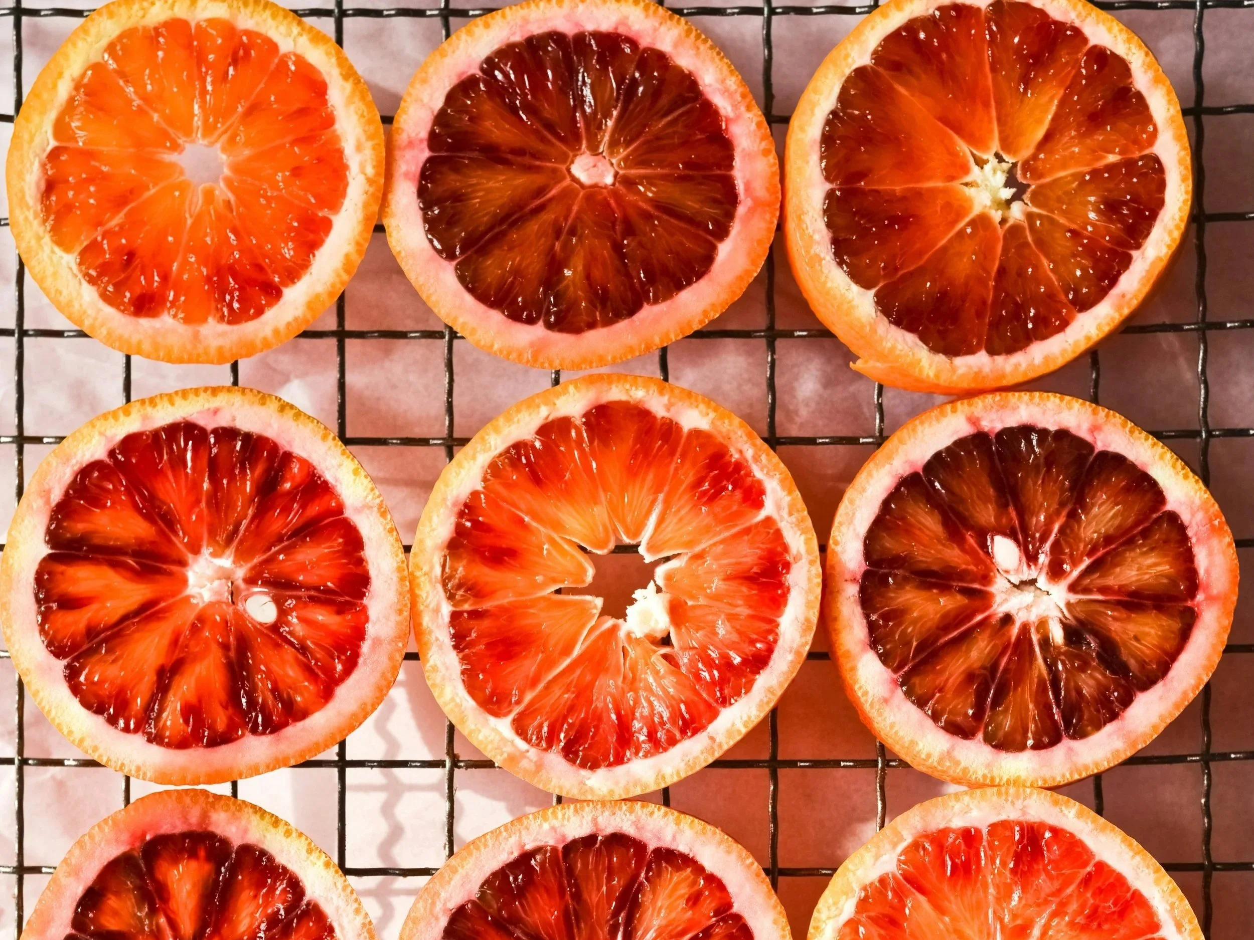
Wasabi and Persimmon: Energy, Play, and Seasonal Joy
If Cool Blue and Jade ground the palette, Wasabi and Persimmon bring energy back into focus. Wasabi’s electric green reflects experimentation and creativity, while Persimmon’s warm orange-red signals optimism and confidence.
These colours are best used strategically in Canada. They shine in summer campaigns, limited-edition packaging, festivals, food brands, and social-first creative. Retailers and brands like Indigo, Roots seasonal collections, and Canadian food and beverage startups often use bold accents to mark seasonal moments without overwhelming their core brand.
How Canadian Brands Should Apply the 2026 Palette
The opportunity is not to adopt every colour, but to use them intentionally.
Smart Canadian application means aligning colour with emotion, season, and context. Cooler tones work well for winter, trust, and longevity. Brighter colours bring energy to summer, experiential campaigns, and social content. Accent colours often outperform full rebrands.
Pinterest’s 2026 Colour Palette reminds marketers that colour is one of the fastest ways to communicate understanding. In Canada, the brands that win will not be the loudest, but the most emotionally aware.